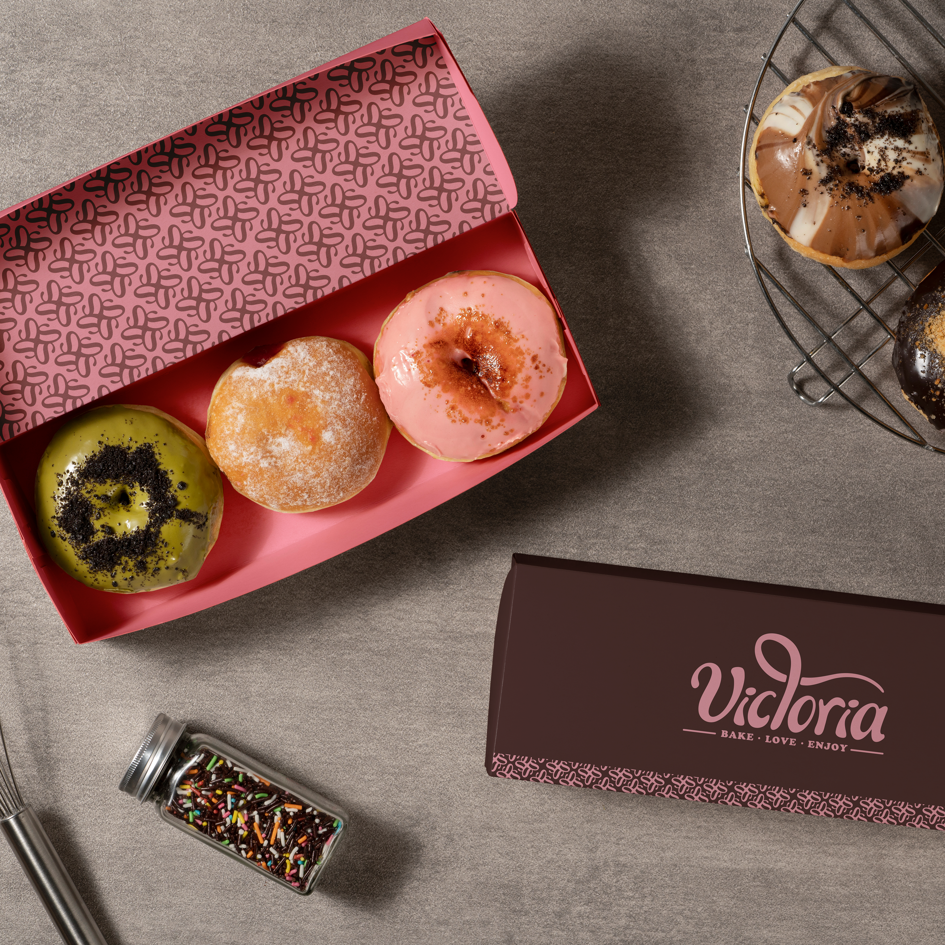
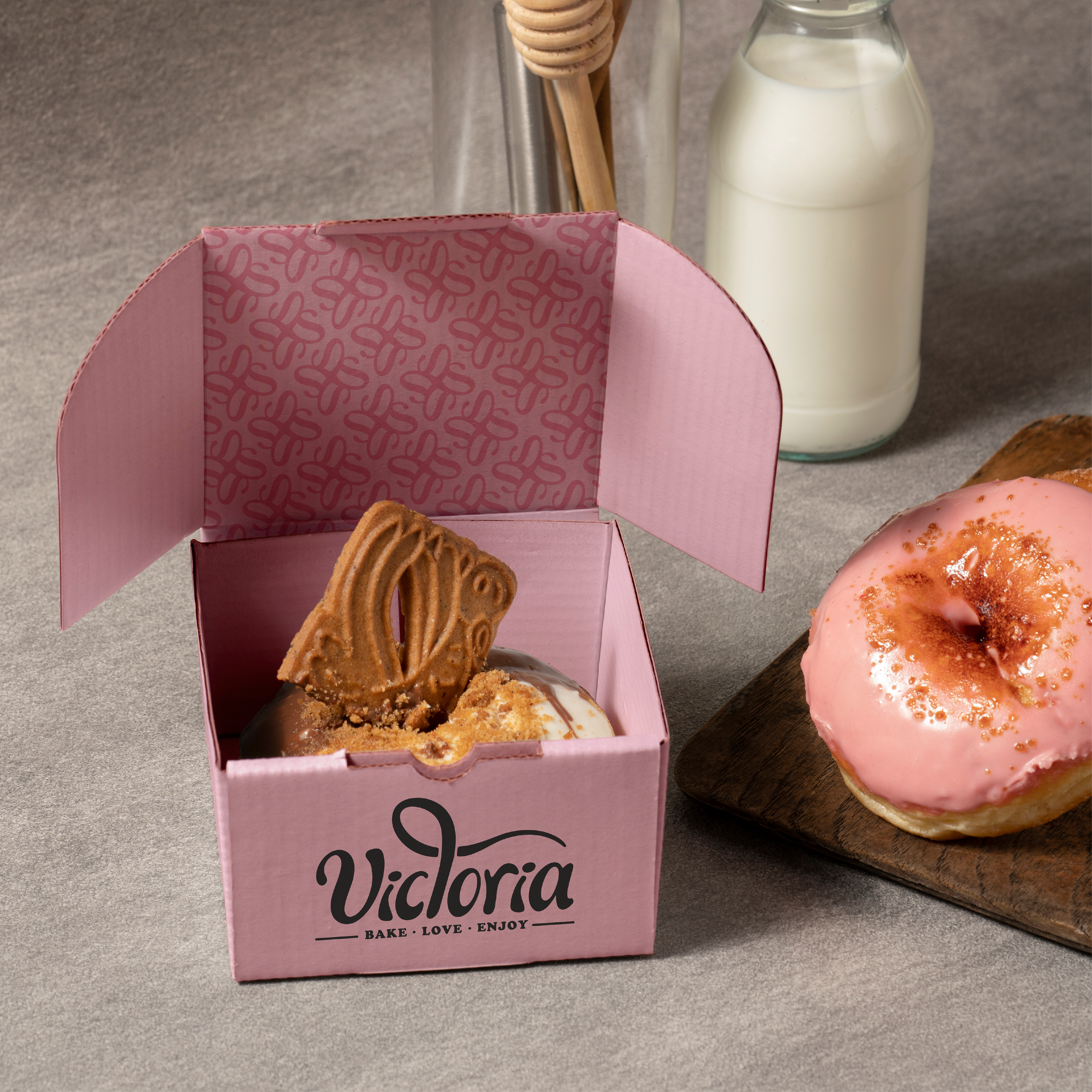
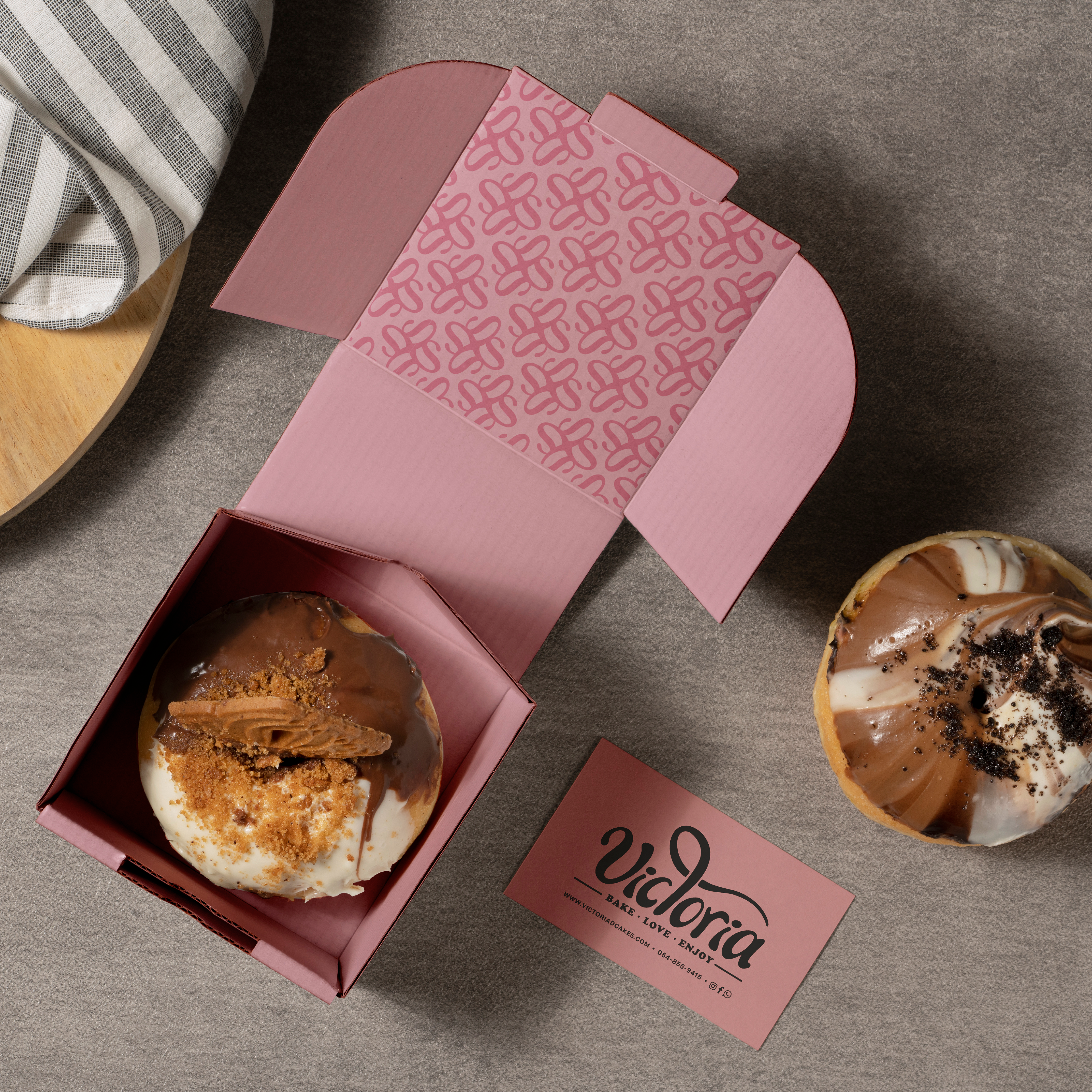
Victoria is a boutique patisserie specializing in unique showcase cakes designed for celebrations and special moments. The branding project focused on expressing the values of creativity, joy, uniqueness, and a sense of luxurious indulgence.
I developed a soft, elegant color palette featuring baby pink, dark chocolate, and light blond caramel—carefully chosen through market research to communicate warmth, sophistication, and artistic flair.
The logo design was inspired by the visual texture of melted chocolate or sweet spreads, evoking a rich, tempting feel. To complement the logo, I created a custom pattern based on the letter "R", which subtly resembles a flower, adding a refined and memorable touch to the brand’s visual language.
The packaging design followed the same visual identity, combining clean structure with indulgent tones to reflect the elegance and delight of Victoria’s signature cakes.


